
A Guide to Mastering Value Contrast
Have you ever been drawn to a stunning pattern, only to find that it somehow overwhelms your look, rather than enhancing it? What I’ve learned over the past 20 years working with clients doing personal colour analysis and finding the best ways of putting each individual client’s colours together, I’ve discovered that understanding the power of value contrast and ideal value can be the key to unlocking your true style potential. Join me as we explore the art of mastering prints, and learn how to make them work for you, no matter your unique features or colouring.
Watch the Video as I show you examples and walk you through this concept:
Embracing Value Contrast: It’s All About Balance
Value contrast, as I always emphasize, isn’t a rigid rule. Instead, it’s a guideline that can be bent to suit your individual style. Take it from my own experience. In the past, when I had stark black hair and fair skin, high value contrast black and white prints were my go-to, effortlessly complementing my high-contrast features. Then I changed to a platinum blonde and a very light ideal value (reminder, ideal value is the same lightness or darkness of your hair, find out more about it here if it’s a new concept for you), which has remained light as I’ve embraced my silver foxette locks. Now, finding the right balance has become key to nailing the look.
The Three Levels of Contrast
Let me walk you through my journey of breaking the value contrast rules, using black and white prints as an example which is naturally too high value contrast for me now that I have a medium value contrast.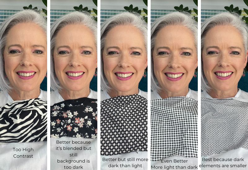
Level One: High Contrast Drama
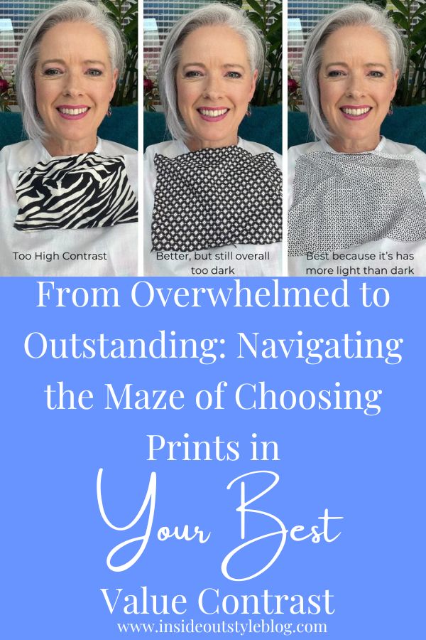
See above the first picture of me (left) in a bold, stark black and white zebra pattern. The starkness of the contrast overpowers my appearance, making the pattern the focal point, not me. Not the ideal look, right?
Level Two: Finding a Middle Ground
Now, the second floral print is slightly better and this is because it’s a more blended print that has light, medium, and dark in it making it more wearable for me with my medium value contrast. Now the third image is a pattern with some gray tones incorporated. This slight shift reduces the harshness of the contrast, creating a more balanced and manageable look. But you can see that it’s still not ideal and wears me, rather than me wearing the print.
Level Three: Achieving Harmony
Here’s where the magic happens. In the fourth image, even though we’re back to a straight black-and-white pattern with a predominantly light background this works much better because the background value is the same as my ideal value (light) but it’s still not as good as the final (fifth) print which again, even though it’s a black and white print works wonders for someone like me with lighter hair. as the volume of the dark is further reduced as the size of the black elements are smaller, almost making the print appear to be grey rather than black and white. By minimizing the dark elements and emphasizing the light, the pattern starts to complement my features, rather than overshadowing them. So even though I wouldn’t normally wear a black and white print as the value contrast is too high, I could wear this one fairly easily (it’s all about knowing how to bend the guidelines to fit you).
Unlocking the Secret: Balancing Proportions and Shades
The key lies in the interplay of various elements within the pattern. Consider these tips as you navigate the world of prints and patterns:
Proportion Matters: Your ideal value matters when selecting prints. So if you have dark hair, you want a darker background or more dark elements in that print. If you have medium value, then look for a print with a medium value background, and of course, following this logic, if you have a light ideal value, go for light background prints. This subtle shift alone can significantly alter the overall impact.
Play with Shades (Values): Introduce intermediary values, like gray, or another mid-tone if your pattern is in colour to soften the stark contrast. Think about looking for prints that are more blended with elements of light, medium light, medium, medium dark and dark rather than straight light-dark prints. This simple addition can work wonders in creating a more harmonious and flattering appearance.
Size and Volume: Keep an eye on the size of the print elements. A smaller amount of the print that is not in your ideal value, so for me, it means more light and less dark. This can balance the visual impact and prevent it from overshadowing your natural beauty.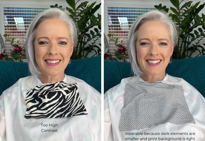
Mastering the Art of Wearing Prints: You as the Star, Not the Garment
When it comes to wearing prints, the ultimate goal is to ensure that you shine as the star of the ensemble, rather than letting the garment steal the spotlight. Mastering this art requires a delicate balance of understanding the interplay between your unique features and the patterns you choose to adorn yourself with.
Imagine stepping into a room and having all eyes drawn to you, not just your outfit. That’s the power of wearing prints that harmonize with your natural beauty. By mastering the art of wearing prints, you’re not merely putting on clothes; you’re crafting a visual narrative that reflects your personality and style. It’s about using patterns to enhance your individuality, rather than allowing them to overshadow your inherent charm.
Think of your outfit as a canvas and the prints as the brushstrokes that accentuate the masterpiece that is you. It’s about creating a visual harmony that effortlessly complements your unique features, allowing your inner radiance to take center stage.
By understanding the nuances of proportions, shades, and the overall impact of the print, you can curate an ensemble that speaks volumes about your confidence and self-assurance. It’s about embracing the print as an extension of your personality, a reflection of your inner charisma that commands attention without overpowering your essence.
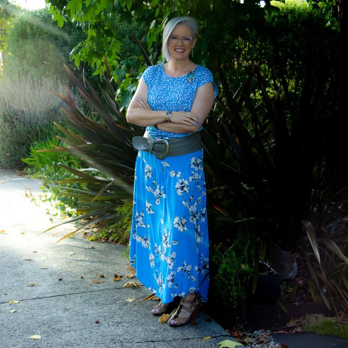
You can apply this concept with any print, not just black and white. Above is an example of me wearing a blue, white, and black print outfit. It works because next to my face the print is medium value contrast (blue and white) and the skirt background is medium value (blue) and the black and white in the flowers (which have some blending shades of teal and yellow) are tempered by the mid-value blue that ties the outfit together.
Remember, when you wear a print, you’re not just wearing a piece of fabric; you’re showcasing your story, your journey, and your individuality. Let the prints you choose reflect the vibrant and multifaceted person you are, allowing your authentic self to shine through, captivating the room with your undeniable presence.
Embrace the art of wearing prints, and let it become a tool that empowers you to express yourself confidently, fearlessly, and unapologetically. It’s not about the garment; it’s about you, the radiant star, illuminating the world with your unique light.
Remember, the goal isn’t to avoid prints altogether. It’s about making them work for you. By understanding the interplay of volume, size, and shades within the pattern, you can wear the print confidently, without letting it steal the show.
Take the Next Step: Elevate Your Style with 7 Steps to Style
If you’re ready to dive deeper into the world of personal styling and enhance your wardrobe, consider exploring my online personal styling programs, including the transformative online 7 Steps to Style program. With a focus on self-reflection and practical tips, this program can help you unlock your unique style potential and embrace your individuality.
Let’s break the value contrast rules together and embrace the power of stylish self-expression!
Further Reading on Contrast and Value
How to Elevate Your Look with the Right Value Contrast in Patterns
![]()
![]()
![]()
![]()
![]()


